The Lonely Mountain

The Lonely Mountain
Showing posts with label character design. Show all posts

Thursday, 20 February 2014

Updated Eagle Model

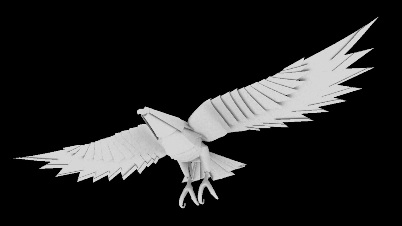
George had begun some tests on rigging the eagle and had asked ne to update the wings to add in some more feathers, straighten out the wings and slim the connection between the wings and body. In addition, I tidied up some of the geometry, enhanced the lines on the head and changed the way the sections wrap around the wings a little. I re-rendered these with a little transparency on the wings and tail, which gives it a more vulnerable papery look.


Monday, 17 February 2014

Eagle Design

This is the semi-rough character design of the eagle, on which John M. based his 3D model. It is essentially a mixture of elements from our initial eagle designs. I just sketched all the elements together on a sheet.

Eagle Version 1

Here's the first version of the eagle model, so the riggers can get cracking! And, of course, if anyone wants to experiement with textures as well? The wings were a bit of an issue, in terms of the overlapping elements. So, I've slotted them in to one another to allow room to move up and down - we may have to widen them depending on how large the movements of the wings are.

These test images are just with some ambient occlusion - the file is on the shared folder. Any feedback is welcome!


Tuesday, 4 February 2014

Dargrgronsndvghnmhj,.k

Apparently I'm only capable of drawing cute goofy things?? Finally starting to get somewhere though maybe I think...


Dragon Concepts

Here's what I was thinking for the tone/look of the dragon, it's a little rushed but you get the idea. He's an evil, greedy, badass... which I tried to reflect.

We should try to pay close attention to the overall shapes and shilouette of the dragon, as that's pretty much all we see until the money shot at the end. Most of the details will probably get lost, and the overall body shape is far more important than the head.... but I drew a bunch of heads.

The middle/left one is the only one I'm particularly fond of... it's got  slight eagle look to it, which I reckon would add a nice touch. 


More dragons

Reworked my dragon a bit to make a little less cutesy. Made it a bit less podgy and smiley and a bit more sleek and spiky.


Monday, 3 February 2014

Character Concepts

Done some character concept sketches for the Eagle and the Dragon, then I took them into Photoshop to test some paper textures and colours...

Parchment colours:

The Eagle on the left I made darker and had fiery golds shining through (as the Eagle is "corrupted by Morgoth" and goes through flame and sorcery to become a dragon):

Light parchment colours, was experimenting with how to make them look similar, as the Dragon morphs from the Eagle:

Experimented with adding flecks of foil gold to the paper texture as this is Smaug The Golden:

Tried a slightly cooler hue as I wondered if the paper Dragon might blend into the parchment-like map background too much in the film, depending on the final look of the background environment:

Turned up the contrast to experiment with the foil gold texture, kind of looks like fire on the surface of the dragon now:

- Lilly

Rough Character Designs

Here are two rough character designs, one for the dragon and one for the eagle:

 I tried to make a nice body shape for the dragon, and I tried to make his head shape to look like the Smaug's head, from the film (big jaw, similar horns, etc). But I didn't spend much time to the wings.
On the eagle, I tried to make his wings to look nice, while I made some other body parts (head, legs) not to imitate folded paper.

Initial dragon design

He's far too cute for my liking at the moment, working on head redesigns as we speak. But I'm fairly happy with the body for now. Thought I'd pap it up here anyway before the meeting this afternoon.